This is the PDF file that I made for FMP review session.
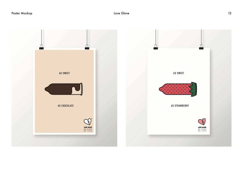
The general feedback was nice and I do not have much to change. They liked the handmade packaging. The only thing that was pointed out was the poster with photograph. It does not get along with the other posters, which are illustrator based. Therefore, I am going to make another illustrator based poster with the photograph.
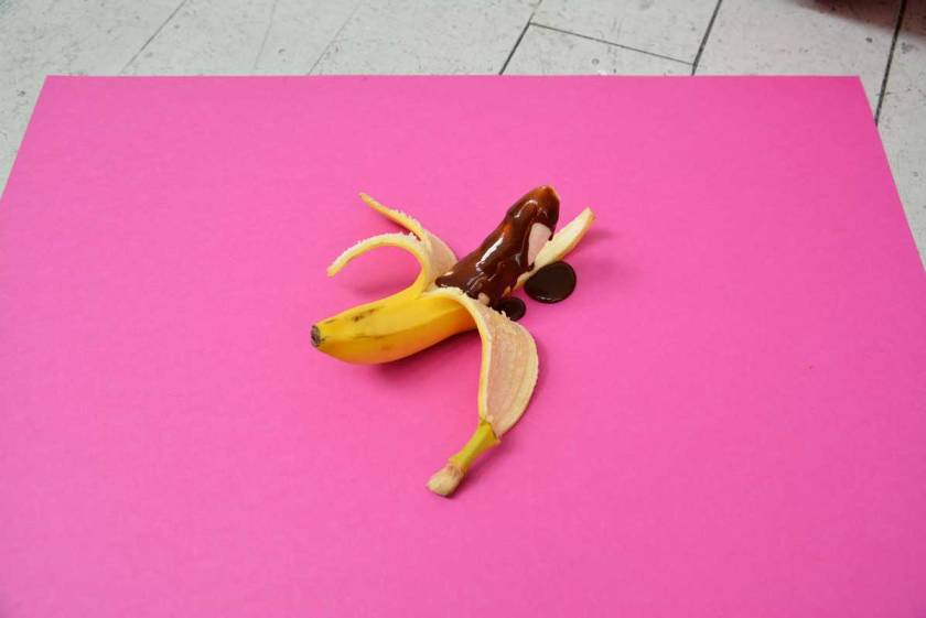
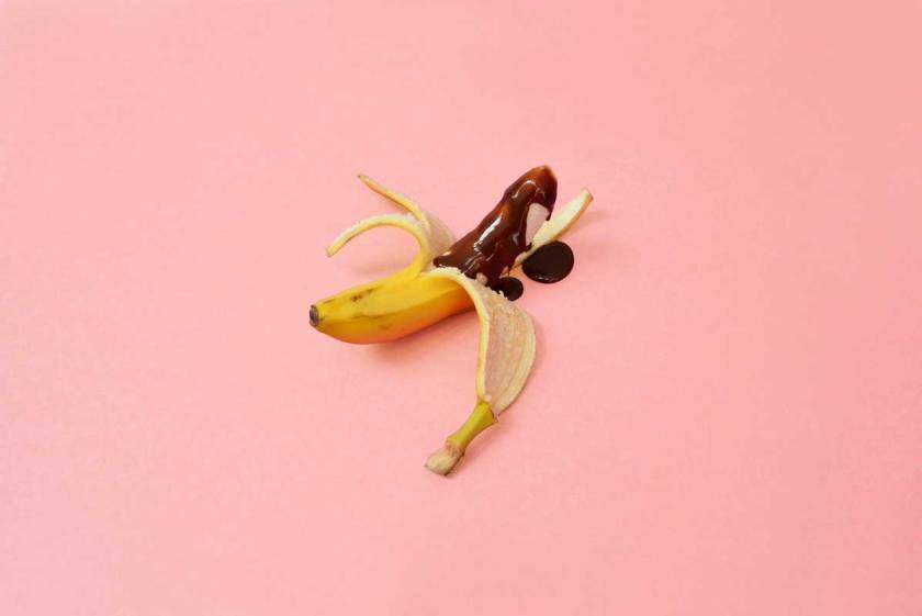
I took pictures of the finished sample of the packaging and the photograph of a banana so I could use it for posters. The pack shot came out pretty well but some of the pictures were not clear because of the reflection on the surface due to the adhesive film attached on the packaging.
I took the picture of banana with chocolate syrup on top to allude the image of chocolate condom. I wanted to use pastel pink as a background but there were no pastel pink paper so I changed the colour with photoshop. Below is the image of banana after colour correction.
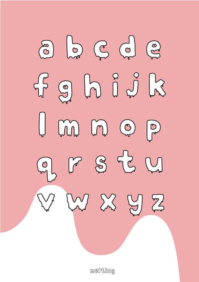
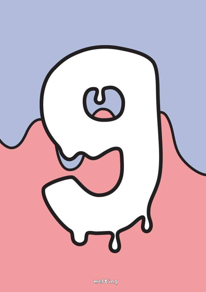
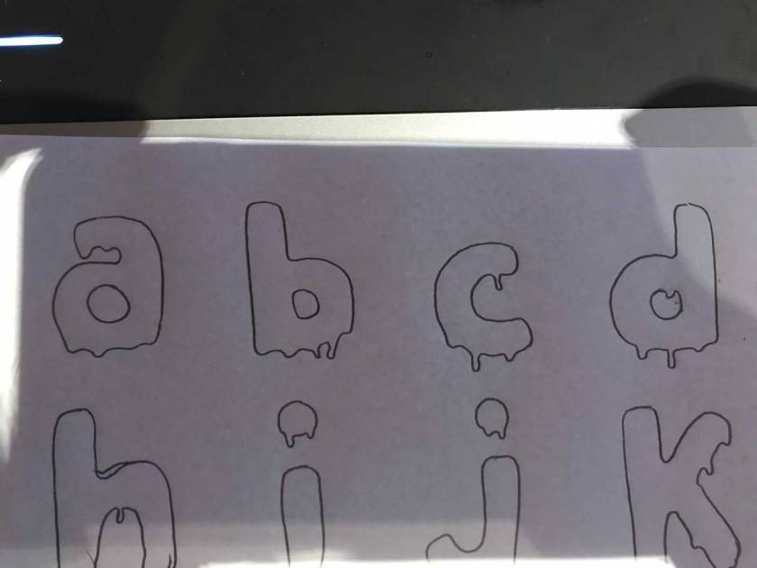
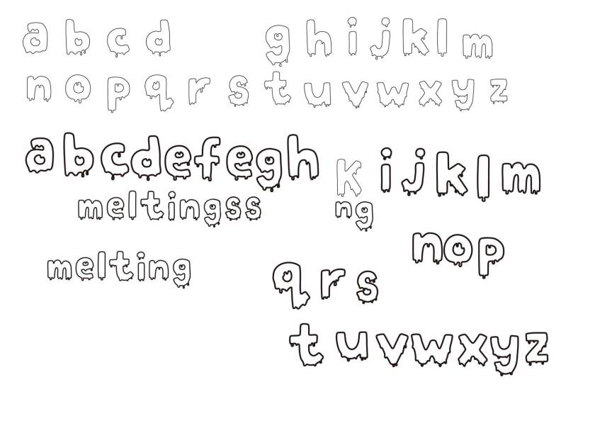
Below is a type specimen and poster. The name of the typeface is ‘melting’. ‘Melting’ is designed based on the imagery of melting ice-cream. It was inspired by the image of ice cream melting in a hot weather. This decorative typeface can be used widely as if what it is in the poster.
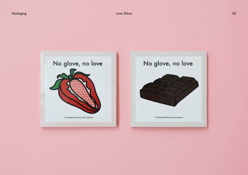
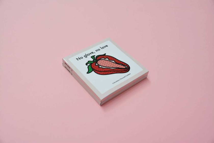
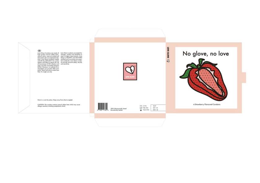
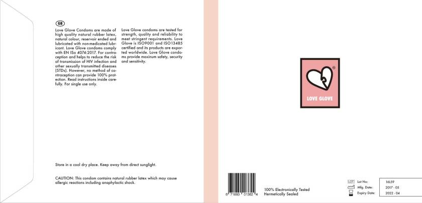
These are the final packaging of the condom. As I was advised, I put the chocolate and strawberry image on the front cover and put the details on a inner sleeve which is not seen when the front cover is covered.
I have copied the formal information from another condom brand to make the packaging look real. I also added the Lot number, Mfg date and expiry date on the back cover.
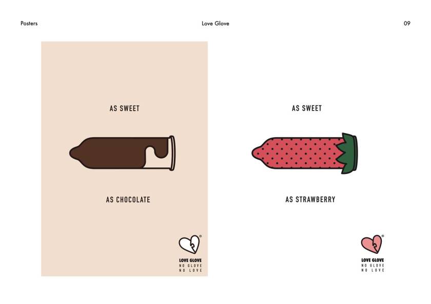
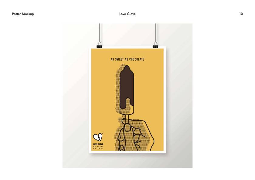
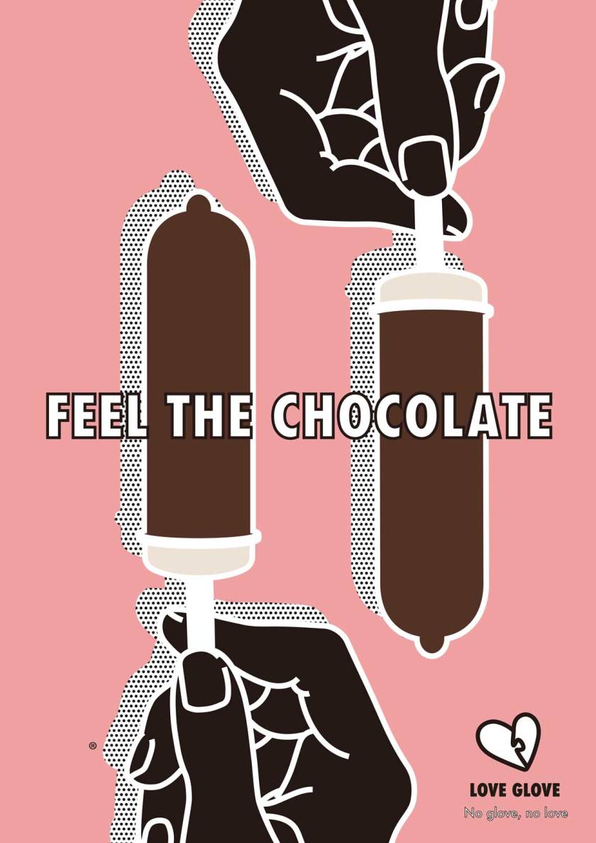
This is the sample poster for the advertising. I think it is too decorative and not very persuasive. I think that I am using too much colour, which makes it complicating. I have used the image of ice cream bar to make it seem like chocolate flavoured condom. The tip of the ice cream bar is not pointy enough, makes it not look like condom. I will be experiment with colours, arrangements and slogans.
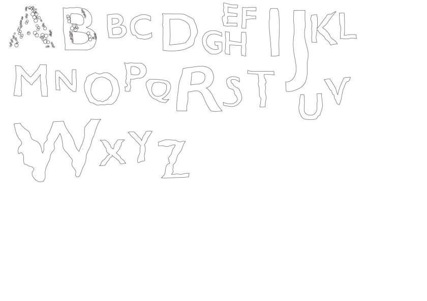
Below is the typeface that I designed based on the outline that I made last week. I used the image of bubbles to make it look like underwater. However, the problem is that it does not look like bubbles when the letters are small.
I have decided to create a whole new typeface because the underwater typeface does not work well. I drew the letters on a layout paper and later drew on Abode Illustrator.
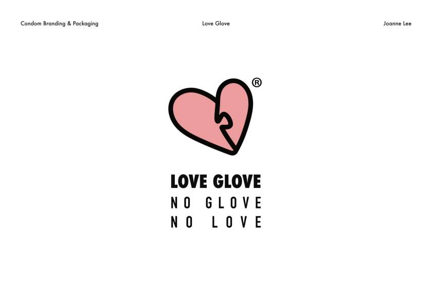
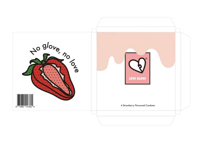
I have been working on the brand name, logo and slogan and this is the logo. The name of the brand is ‘Love Glove’, which is the word widely used as a slang for condom. The logo is a love heart shaped puzzle. The slogan is ‘No glove, no love’, which is a parody of a popular phrase ‘No condom, no sex’.
I am going to focus on two types of condom, which are chocolate and strawberry flavoured condoms. Below are the packagings. Tutor suggested that the image of chocolate and strawberry syrup flowing down is too direct, so it can be more simple. Also, the main image of the chocolate should be on the front, while logo on the back and barcode on the right middle. The slogan should be written straight so the blank space does not look awkward.
I have also worked on the packaging of condom. I would like to use the blister packaging which is popular for pills. I think that this would be hygienic and easy to use.
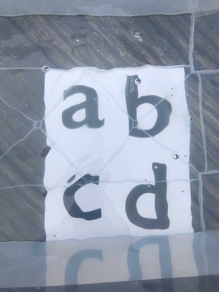
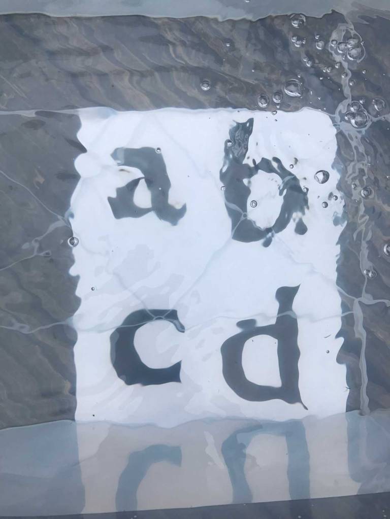
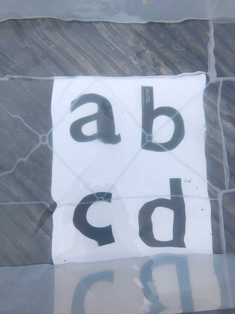
I have placed the printed piece of letters under the transparent water tank and photographed the distortions that water waves makes. I have photographed every single letter.
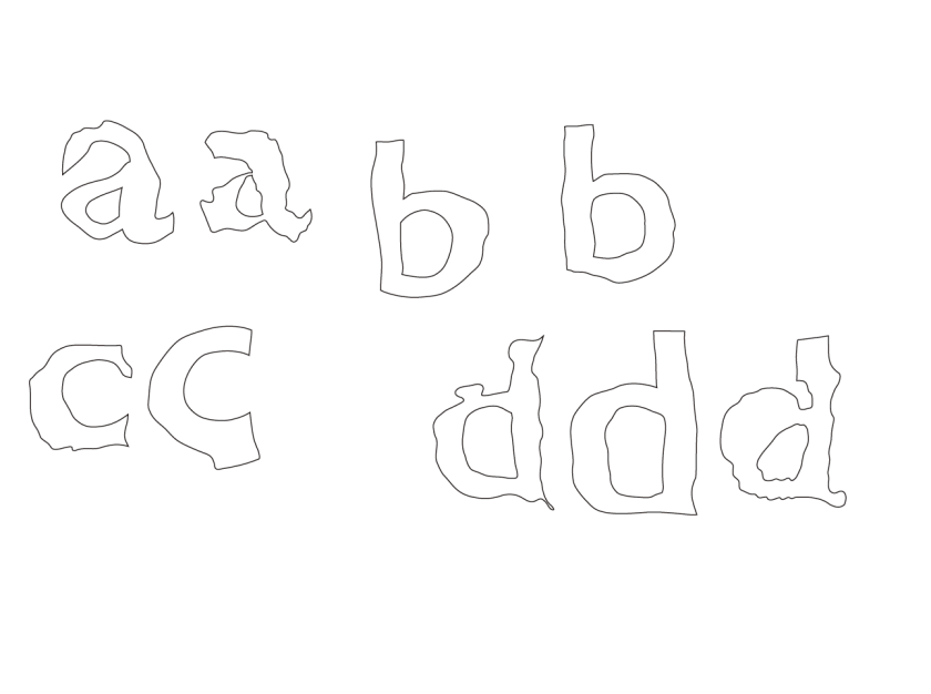
Below is the design of letters done on illustrator. It is not successful that the distortions does not look like it is underwater, but it look more like burnt letters. Tutor advised me to use these alphabets as a guideline and use the bubbles to create a letter. For next week, I will be using bubbles to design all twenty six alphabets.
I have been working on the logo and patterns that can be used for packaging. I have mainly worked on the love heart shape and the image of inserting something through lock and key and puzzle. I also drew a woman in a lock but I think that this might be sexism because condom is not a item that is only used by straight couples. I think I need to research more about social recognition because it can be sensitive for particular sex groups. Through yesterdays tutorial, I was commented that my designs are feminine so I can target particularly to women. I think setting a specific target audience is good that it suggests which style I will need to work on. I know a lot of friends who never buy condoms because it is embarrassing and they think condom is a men thing. Based on my experience, I would like to design a condom brand which my friends and I would buy.
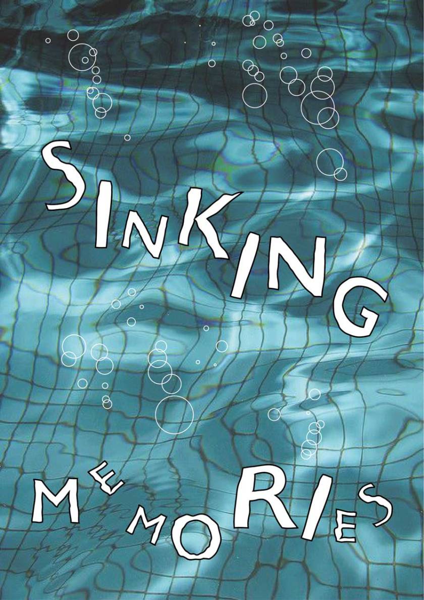
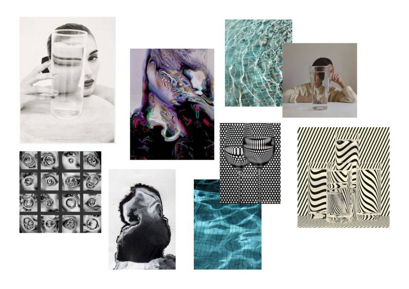
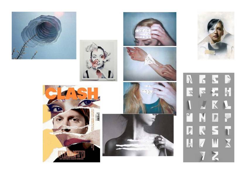
The first mood board is about distorted images created by the water. I would like to use this distortion to create a typeface. I think it would be interesting that there are so many ways of distortions. However, I am worried that if it might not look as a word in underwater because there would be no background image on a typeface, so it is difficult for viewers to understand that the word is in underwater.
Second idea is using the image of teared paper. I would like to design the edge of the letter as if it is teared off. However, the problem that it won’t be work properly on illustrator and it is very difficult to create because typeface only use black and white colour. Therefore, paper folding is another idea.
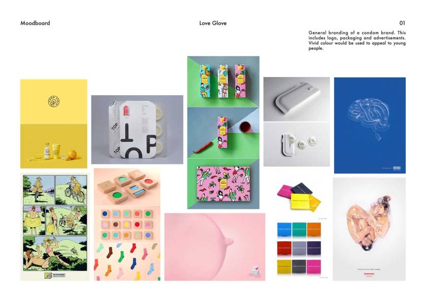
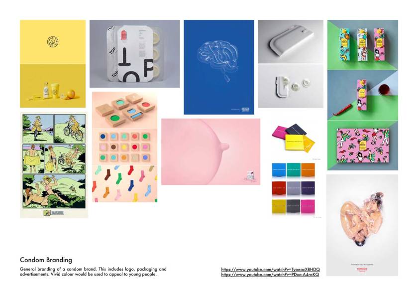
These are two mood boards for the FMP ideas. First idea is working on condom branding, packaging and advertising. I would like to design a condom brand which targets young people. Therefore, I would be using vivid colours. I would also like to make an advertising and this includes poster and short film.
These are the two example of the advertising film. First is an advertising for MTV, which I think is quite direct. The slogan ‘Sex is no accident’ works perfectly with the film. Second film is a Korean advertising. They use socks as condoms. I think this reflects the Korean society that they do not reveal sexual subjects to the public, therefore, it is more indirect and metaphorical.
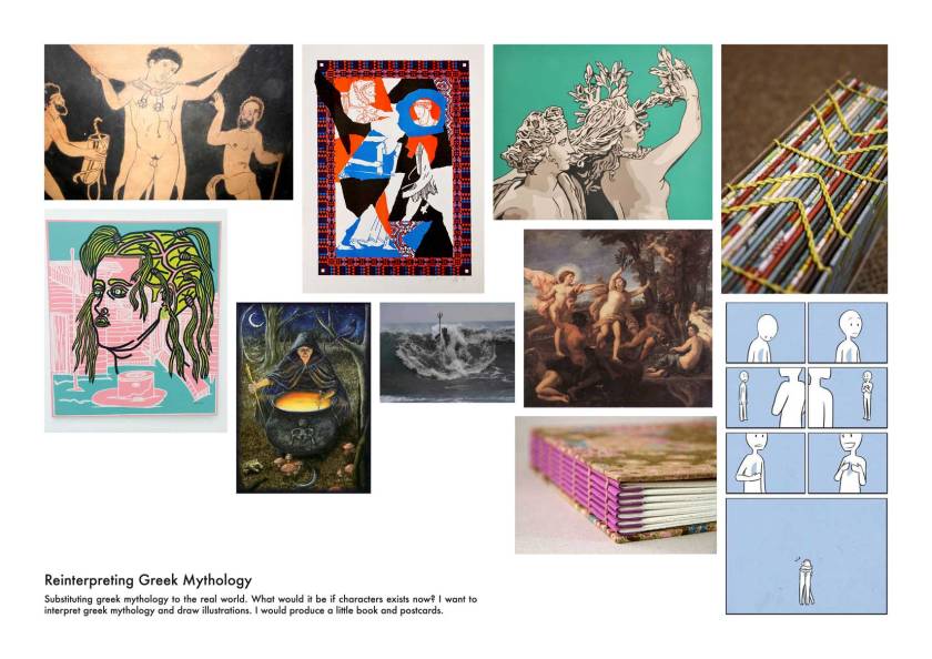
Second idea is about reinterpreting greek mythology. Since I have great interest on greek mythology, I would like to reinterpret old greek mythology into something modern. It would be fun because the historical situation between the greek mythology and nowadays is really different. I would like to investigate whether what happened in the greek mythology would be accepted todays.
Tutors advised to choose first idea which would be more fun and would be able to gather more interests.


 Second idea is about reinterpreting greek mythology. Since I have great interest on greek mythology, I would like to reinterpret old greek mythology into something modern. It would be fun because the historical situation between the greek mythology and nowadays is really different. I would like to investigate whether what happened in the greek mythology would be accepted todays.