

These are the final packaging of the condom. As I was advised, I put the chocolate and strawberry image on the front cover and put the details on a inner sleeve which is not seen when the front cover is covered.
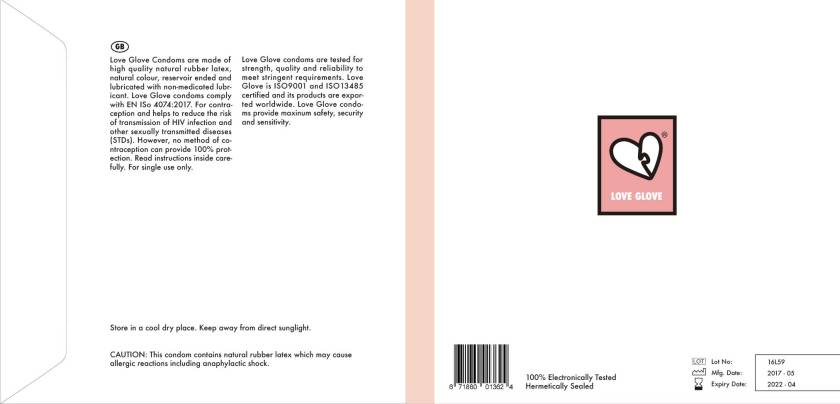
I have copied the formal information from another condom brand to make the packaging look real. I also added the Lot number, Mfg date and expiry date on the back cover.
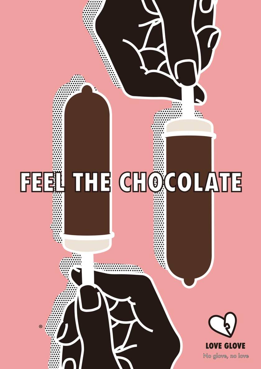
This is the sample poster for the advertising. I think it is too decorative and not very persuasive. I think that I am using too much colour, which makes it complicating. I have used the image of ice cream bar to make it seem like chocolate flavoured condom. The tip of the ice cream bar is not pointy enough, makes it not look like condom. I will be experiment with colours, arrangements and slogans.
