YCN Final Outcome

‘THINK Once More’ is an advertising for the campaign THINK road safety. The focus of the design is a hidden risks of drink driving that people might overlook. Adobe Illustrator designed coasters are to be used under the beer glass which has a broken glass on its bottom. It makes the illusion as if the glass if the car is broken. Using the beer bubble, people cannot see what is beneath the beer. But when the beer is gone, people can see the image on the bottom of the glass and this reminds them of possible danger of drink driving.

These are the posters and the mockups for the THINK campaign.


THINK Campaign Drink Driving

This are the posters and a film for the THINK campaign. I have filmed using the beer goggle that I made. I wanted to show how alcohol makes distorted and blurred vision. Model tries to use computer and mobile phone and show how difficult it is when a person is drunk. I got the feedback that the poster is not styled because the model is wearing random clothes. So many of the viewers did not understood what the film and poster wants to communicate.

I think that I need to start with the new idea because I think that beer goggle is not real enough. I have think of using coaster and beer glass for the poster.


YCN Intial Idea

I have used the After Effects to make the film of car falling into beer. I will going to make the QR code on a beer bottle, so everyone can take a look. When the viewer search this QR code, this film will be appear with the strapline ‘Don’t drink and drive’.


Final Magazine: HOBEE

‘Hobee’ is a magazine that introduces hobbies of different people and suggests you to have one yourself. ‘Hobee’ is a compound word of hobby, bee and honey and it means that hobby is something that makes your life more sweet and enjoyable. Hobbies can be very ordinary such as listening to music and watching television or it can be minor such as collecting antiques. Target audience of this magazine can be anyone who finds new hobby.

Final Editing/ Printing/ Binding

final-dragged

Finally, I changed the cover to a photograph of someone putting her hand into a box. I wanted to make viewers to think hobbies to be something that they can choose and it suggests that they can collect and choose any hobbies whatever they like after reading this magazine.

After the final editing, I went to printshop to print. I have printed one copy in saddle stitch binding, which I asked for the printshop. For another copy, I just printed the images on a paper so I can do the hand binding. Based on the mistakes that I have done last time, I tried not to make any mistakes. Instead of binding the book with saddles, I have chosen to bind each page because the outcome would be more neat and tidy. The final outcome would be one that I did the hand binding.

Final Tutorial

I have been working on the title page these days and I have decided to design the cover look cute because of the name ‘Tasty’. I was thinking of shooting a person’s tongue with sweets on it. While finding the reference, I have found the image of Einstein with his tongue pulled. I think that using already existing image would also be good because it is already familiar to viewers. Instead of using the exact same image, I tried to do the collage on the image.

Left is what I have done first. I wanted to make it look like someone spill sprinkles on a photographs so I added some sprinkles over his face.

However, on the last tutorial, tutor told me that this cover does not look like a cover of the magazine about hobbies but more like a food magazine. The title is also not working, so I need to change the title as well. The strapline should suggesting more about the magazine instead of being too abstract.

Editing Process, Photoshoot

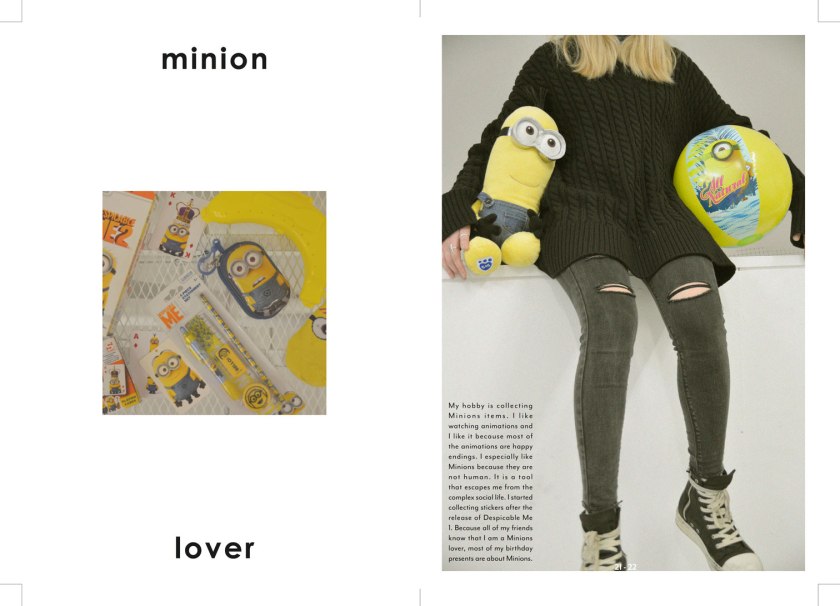
Last weekend, I photographed and interviewed Jineun Seol about her hobby, which is to collect items associated with minions. I tried to photoshop the images because I think that the bright yellow colour of minions does not match to the general tone of the magazine. I decreased the level of contrast to make yellow look dull and calm.

3-print-draft-dragged


Printing Sample

img_5697

img_5699

Today I went to printshop to check the paper stock and how the colour would print out. I asked them about the thickness of the paper that would be suitable for hand binding and they told that paper should not be too thick if I am doing the hand binding. Before visiting the printshop, I made the mini colour board with the colour that I am mainly going to use for magazine. On the bottom picture, the left is what I printed in the print shop and right is what I printed in school. I found that the printer and the paper matters when printing. The colour was so different that it does not seem like the same colour.

Bookbinding Sample

I tried kettle stitch binding which I am going to apply for my magazine. I have made some mistakes which are:

  • I made even number of holes. I have to make odd number of holes.
  • Hand binding each pieces of paper takes too much time. Doing hand binding with saddle stitches would shorten time but I have to take care of the number of pages and the order of the pages. However, problem of stitching saddle is that the side of the magazine would not be neat because of the thickness of the paper. Therefore, I should use thin paper if I am going to stitch into saddles.
  • When I did the binding, I made every next stitch on the first stitch. I have to make stitch on the stitch right before it. The last picture shows that stitch became like a ball because I did not made the stitch on the very last stitch.

img_5690

img_5691

img_5789